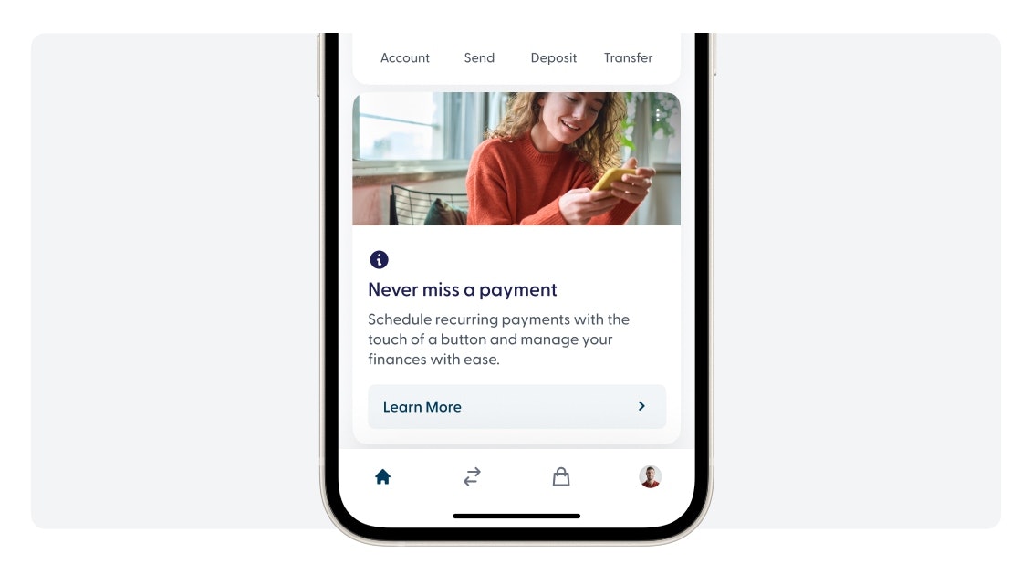
About info cards
Info cards are the best way to market to your members. They are cards that live in different pages of the user interface. You can use them to promote products or simply communicate important news to your members.
Recommended measurements:
1234px by 480px
Achieve better results
We recommend using images with no text. The info cards are designed to have the text in the body of the card. This text automatically scales to any resolution and it's more accessible than having it in the image.
Images should support the copy and reflect your tone of voice and brand guidelines.

Avoid images with text.
The image in the card will adapt to the resolution of the device. This means text might fall out of bounds.

Be mindful of graphic items
The image in the card will adapt to the resolution of the device. This means graphic items placed near the edge of the image might end up out of bounds.

Centered content is always better
The image in the card will adapt to the resolution of the device. This means if a person or element of the image is placed near the edge it might end outside the frame.
